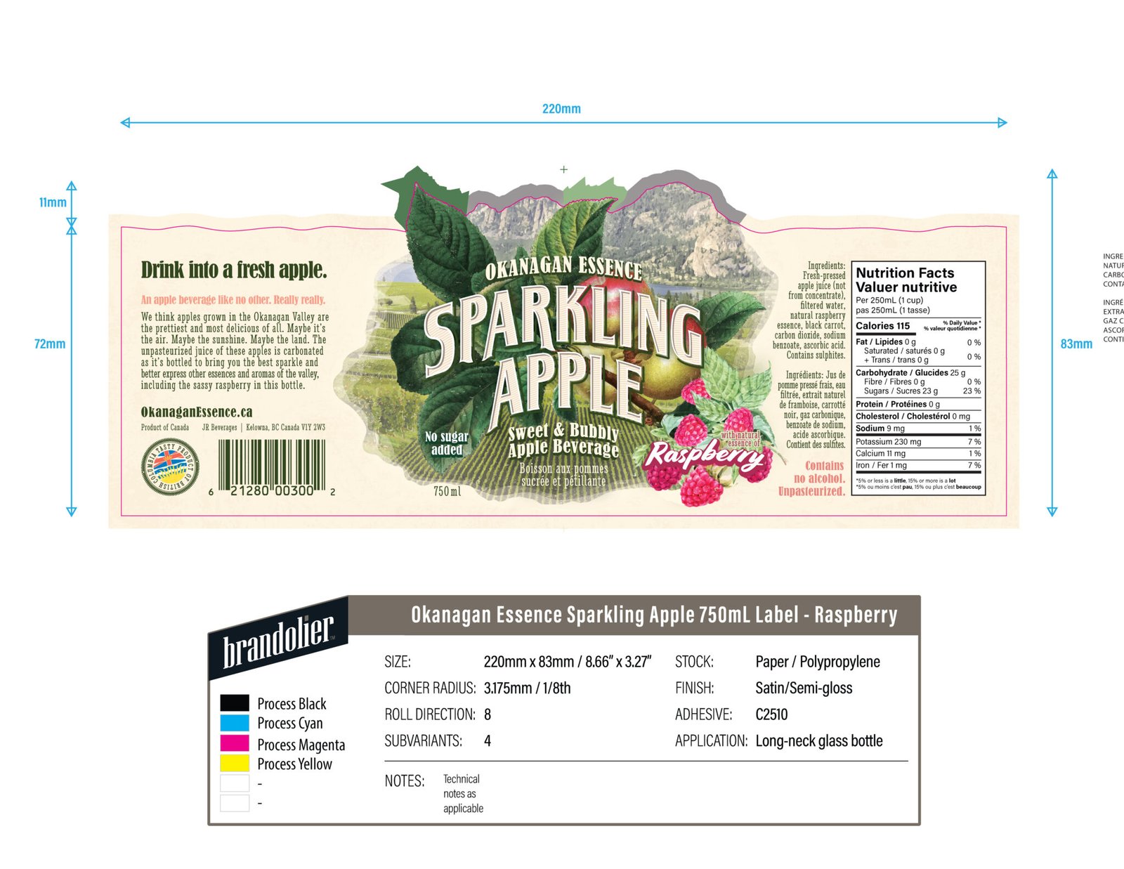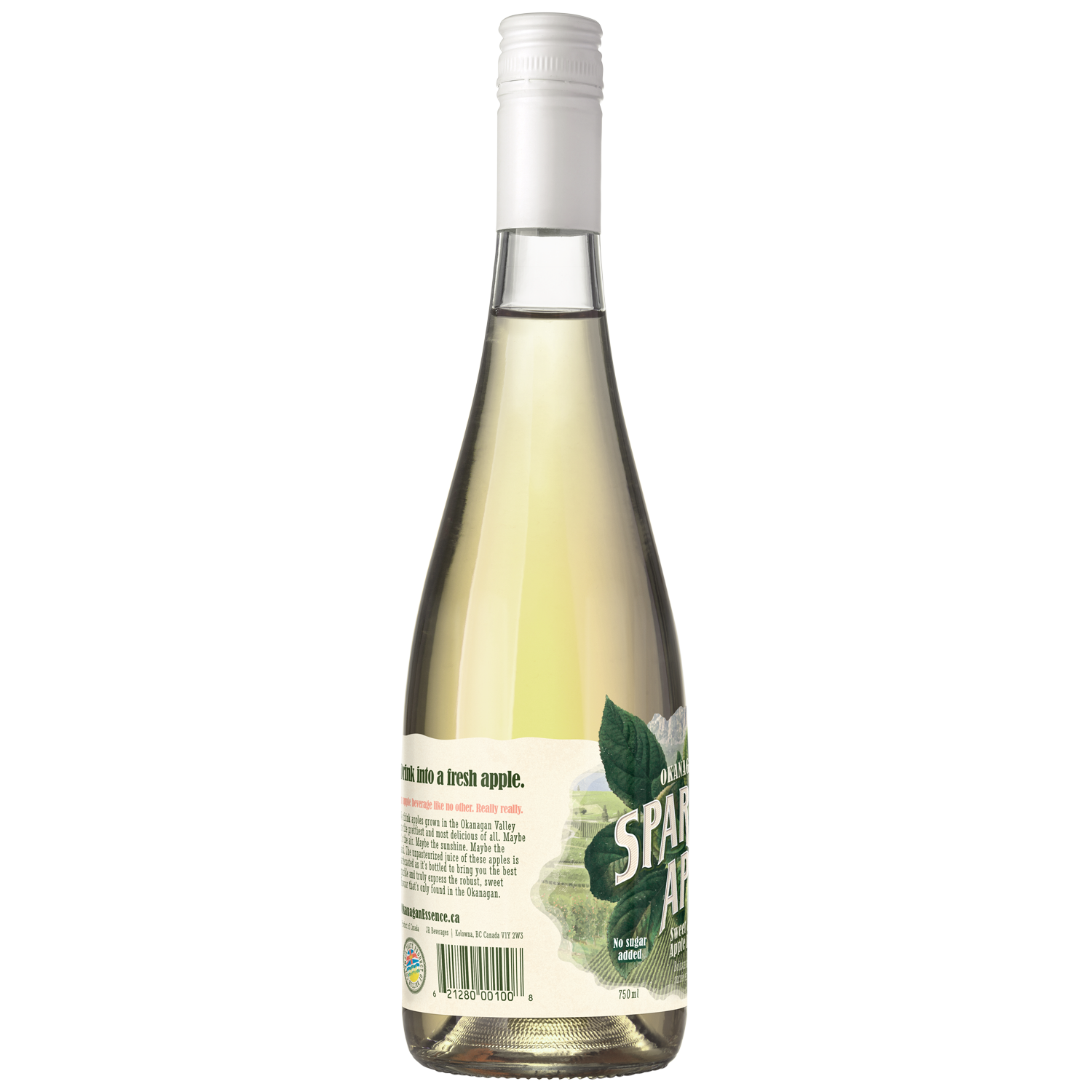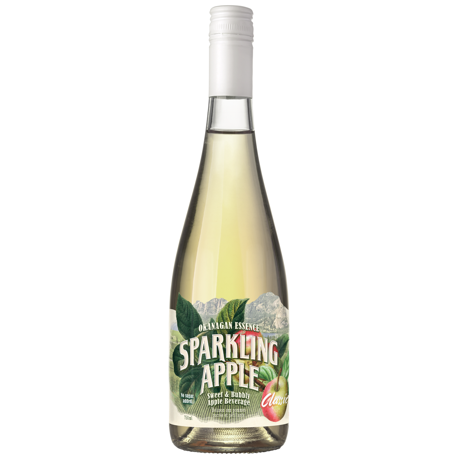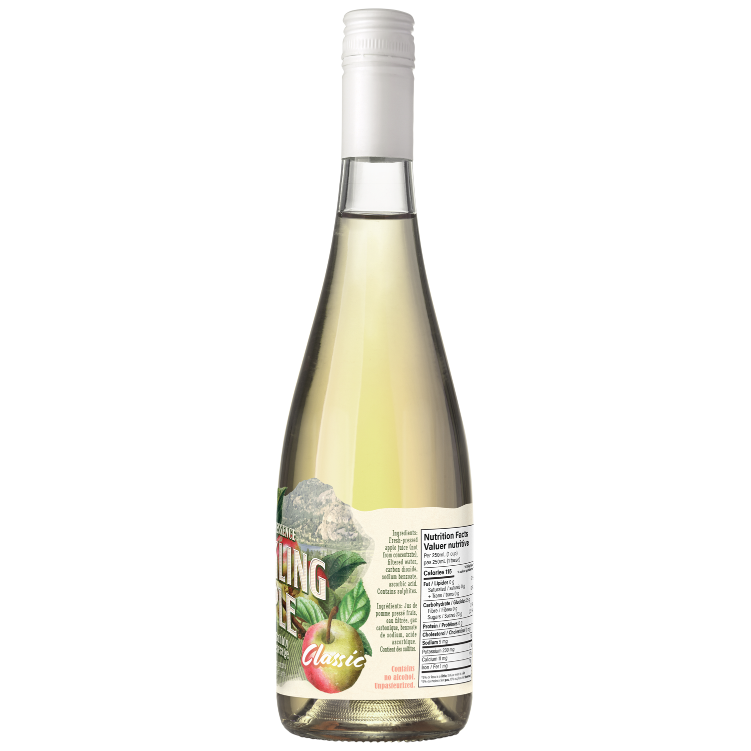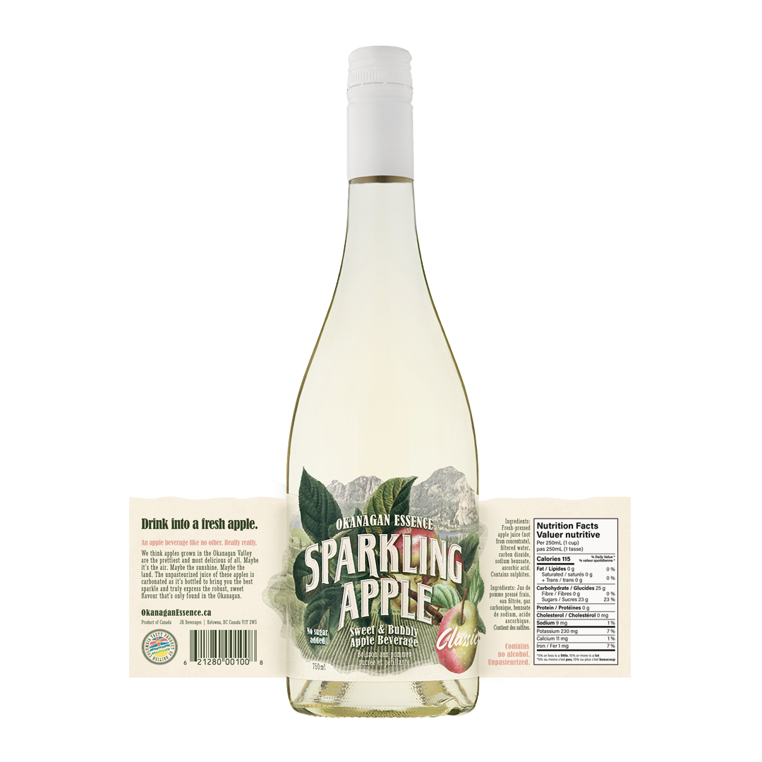
I art directed and designed the packaging update for this amazing sparkling apple beverage company out of the Okanagan. Their existing packaging was drab, plain, and didn't emphasize the local values, key benefits, and alluring beauty of the Okanagan setting that underscores their business.
Working from a 1970's watercolour style, I developed a polypropylene label with custom die that captured the refreshing qualities of the product and the essence of the locale within which these products are manufactured. I worked with the printer to build a set of 9 variations on the background image into the run so that each bottle contains a unique "easter egg" to find, encouraging rebuy and delighting consumers.