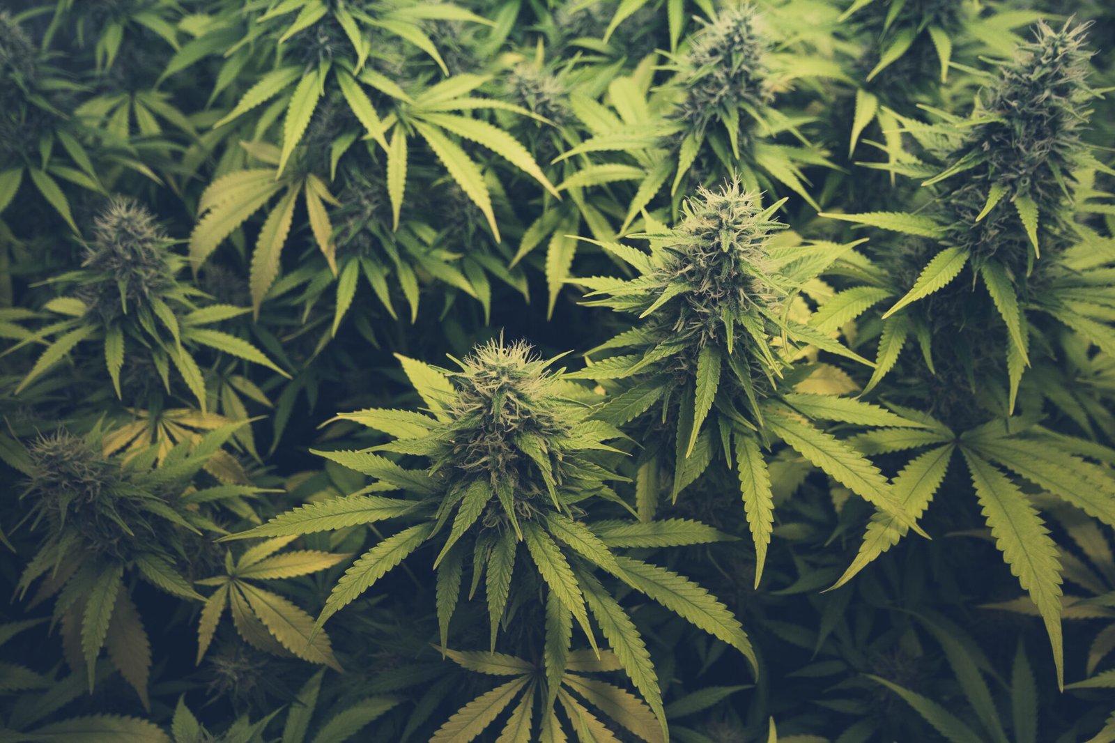
Frequency was a brand developed for a line of cannabis vape products to be produced in the regulated market. The brand was aimed at university students and techy working professionals. I developed a block style wordmark in a wide and thin sans serif with integrated wave/signal element in the middle to support the frequency concept and appeal to the tech user crowd.
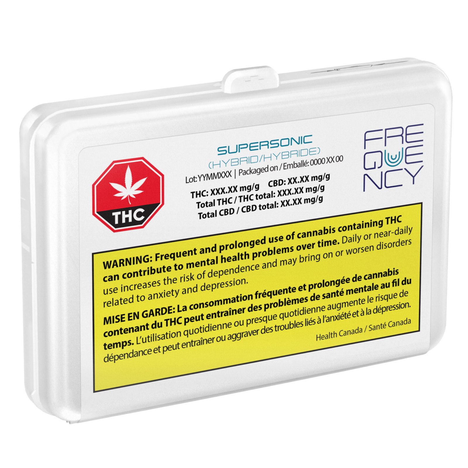
In collaboration with the marketing lead I co-authored a set of product varietal names that both resonated with the Frequency brand and paid tribute to the traditional cannabis strains from which they were based. For example, MAC-1 as Supersonic (pictured), Granddaddy Purple as Ultraviolet, the bright and energizing Sour Diesel as Photon, etc.


The lineup also featured Kenneth. That's right Kenneth - after the REM song What's the Frequency Kenneth? Kenneth would be a "wildcard" SKU that had it's formula changed to a new strain mix on every production run. Though I can't take credit for this little easter egg, i did come up with the idea to run the product name in rainbow lettering with question marks to further distinguish it from the line and competitive set by presenting an unconventional playfulness in the only element on the label that is allowed to express personality other than the brand element. It doesn't sound like much but if you know the regulated cannabis market in Canada you will understand that any small opportunity to create style or brand affinity in a compliance-driven label is like gold.

Combining the use of Photoshop and a 3D model of the Crativ case the products were intended to be packaged in and I generated a set of 3D product images for all SKUs that were built in compliance with GS1 imaging requirements.