
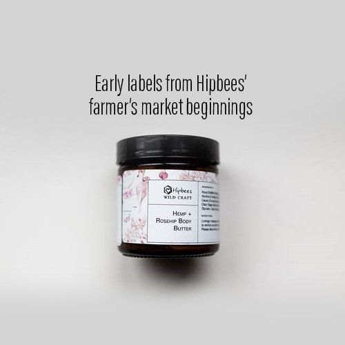
FROM FARMER’S MARKET TO PREMIUM NICHE
Hipbees is a family owned skincare business focused on "wildcrafted" and organic ingredients.. The natural and effective formulations had already made a splash in St. Albert where Hipbees originated and now the owner among the locals, and with the right elements, in the skincare industry. Each product has an important story to tell packaging that reflects the simplicity and beauty of the brand.
APOTHECARY TRADITIONS RE-IMAGINED
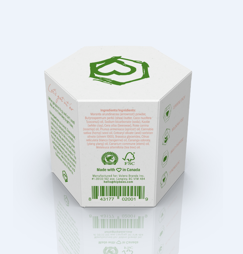
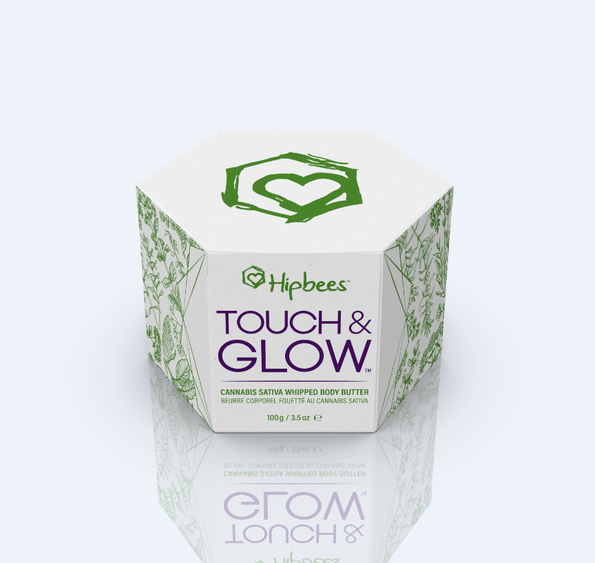
In tandem with fellow collaborators, we sourced responsible/sustainable packaging: reusable immediate containers comprised of glass and bamboo, and outer packaging of FSC and Rainforest Alliance certified paperboard. We targeted our ideal consumers: Women who appreciate safe and practical products that work with the skin to produce glowing results. The outer packaging was built from a custom-made hexagonal dieline that created a "flower" type flourish on the semi-auto locking bottom. Outside the box was kept simple, practical, and minimalist apart from a strip of geometrically contained herbal pattern stripes. Inside the box was printed with a surprise botanical pattern, sacred geometry and self-motivational phrases.

Working from a pre-defined set of cross-product functional benefits I designed this set of 6 icons to be displayed on the product line. The hexagonal form language plays into both the biological/organic aspect of the product but also the honeycomb texture related to the beeswax that gave hipbees it's original name. Subtle symbology makes each unique such as the Venn diagram style-multi-purpose or the trinity-like synergistic. The style was set with a script like minmalistic feel via the variable stroke width.
CONTEMPORARY WILDCRAFT
Terpene-rich, synergistic, wildcrafted, locally sourced, multi-benefit and multi-purpose. Hipbees went from a DIY skincare brand to one that could compete with the masses. Not only does the re-branded packaging and identity reflect the elegance of the ingredients, but it stays true to the brand’s core values. We found a gem that needed to be polished, and gave it the shine it deserves.

All aspects of the brand rollout were carefully and purposefully considered from hand-written style thank-you letters from the formulator to kraft paper shipping tape printed with inspirational quotes.
Building on the spirit of Hipbees apothecary roots I developed a robust digital rollout for the brand that included specialized ecommerce automations and promotions (like a sustainably sourced bamboo towel with purchase), web/social visuals and an interactive Instagram grid where customers could learn about the new suite of products.


I gave Hipbees a literal face with Ester the Face Coach – an imagined personality that was personified from a key Hipbees ingredient - hemp ethyl ester. Ester was a no-nonsense optimist whose mission was to get peoples skin health back to a high level even after they thought they had given up! I set Ester up with her own social media accounts for our team to provide our consumers with educational and useful content framed as if coming from a best friend or mentor. The end game was to supplement the brand’s primary identity and online footprint in an approachable “soft-sell” format that helped bring in new consumers that weren’t familiar with the brand. Facebook and Instagram advertising campaigns were crafted to further advance this touchpoint.
In the weeks following launch the brand experienced a tremendously positive response including garnering attention from prominent influencers such as one of Canada’s top motivational speakers and author of “Focus on the 90%,” Darci Lang.

