
THE CHALLENGE
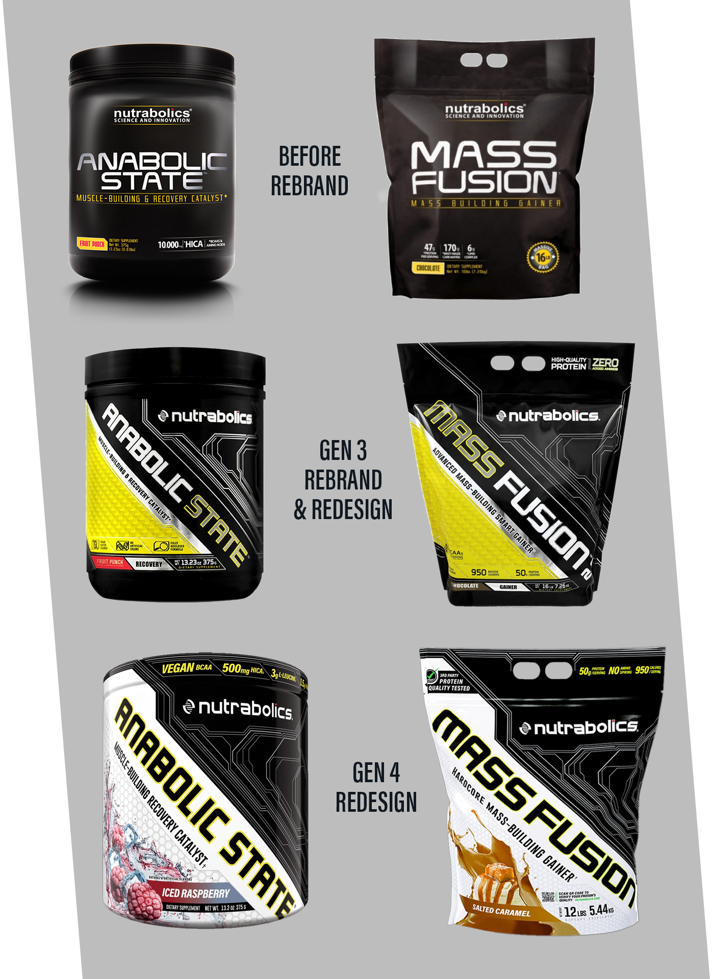
- Nutrabolics was coasting on a line-wide set of matte black labels that were unique for their time but rapidly becoming antiquated
- Their products were getting lost on store shelves (especially in retailers with sub-optimal in-store displays and POS) amidst a growing number of newer brands and products using brighter colours and bold graphic design.
- Their logo was overly complicated and difficult to read at a distance with arbitrary line elements and a “science and innovation” tagline that needed to be felt by consumers instead of imposed upon them.
- The brand itself had no depth or lifestyle affinity to attract and retain a loyal army of consumer advocates.


THE APPROACH
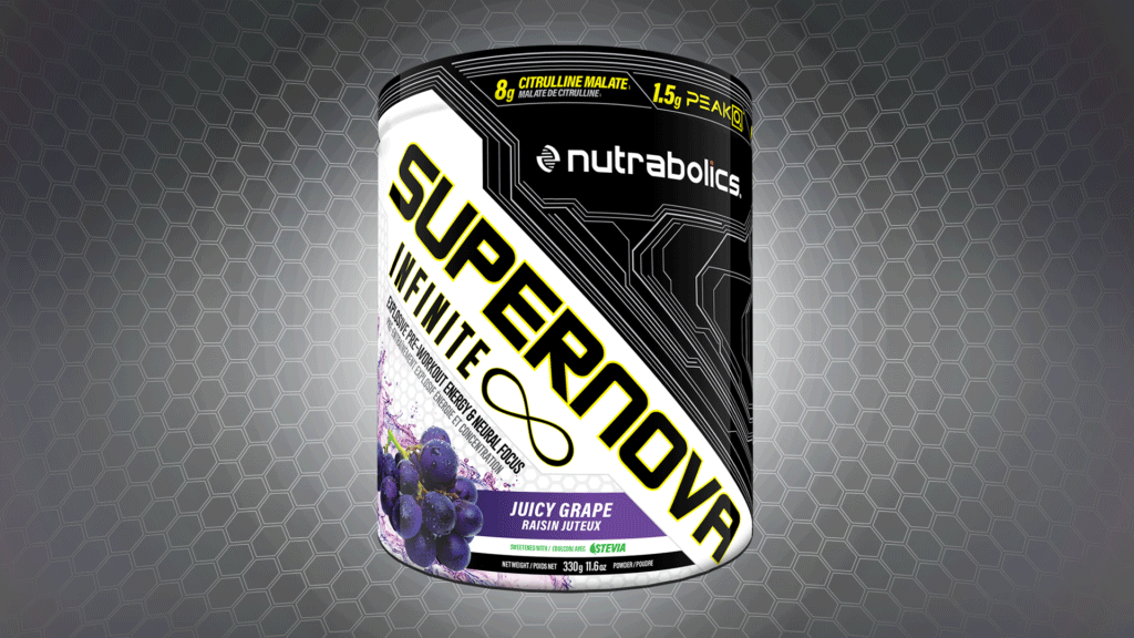
- A position was devised from a growing cultural trend towards futurism. An edgy new wordmark with DNA-inspired “tech helix” icon created an understated means of conveying the brand’s values and presenting a richer identity.
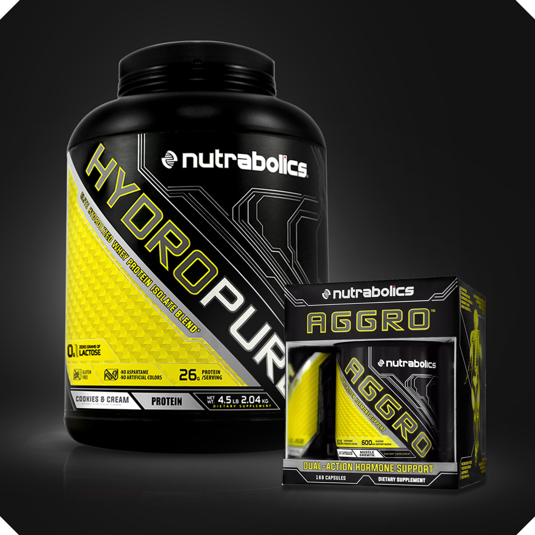
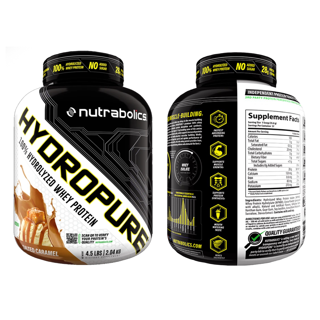
- Form language of biotechnology inspired a dramatic new raised texture pressure sensitive label with a bold, high-tech and premium look and feel
- Product names were rotated by 45-degrees to differentiate against the line’s competitive set. A thicker typeface & icon callouts provided more visual impact.
- Years later, shrink film was sourced to bring a seamless, contemporary feel
- New callouts leveraged an industry focus on formula potency & disclosure
- Back panels were fortified with infographics and clinical research on ingredient efficacy, signature circuitry elements were augmented, and a brighter PDP opened the line up to “softcore” consumers and emphasized flavour appeal.
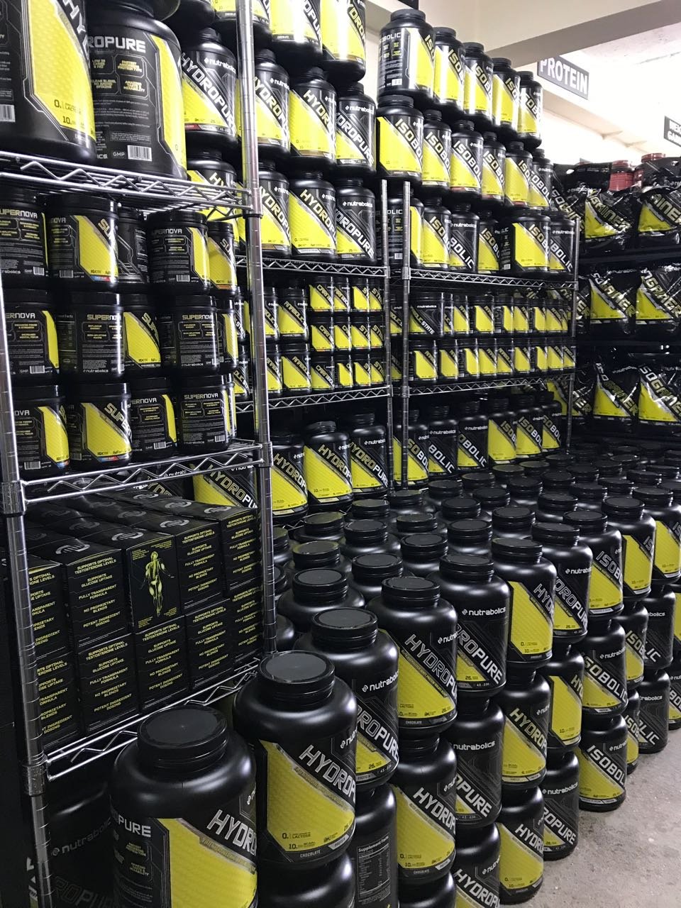
- The update was rolled out to hand-picked ergonomic wide-mouth bottles and other unique package formats including sachets and XL stand-up pouches.
- A new colour identifier system distinguished ketogenic (red)
and commodity (yellow) sub-lines from the main line while
creating added visual variety.
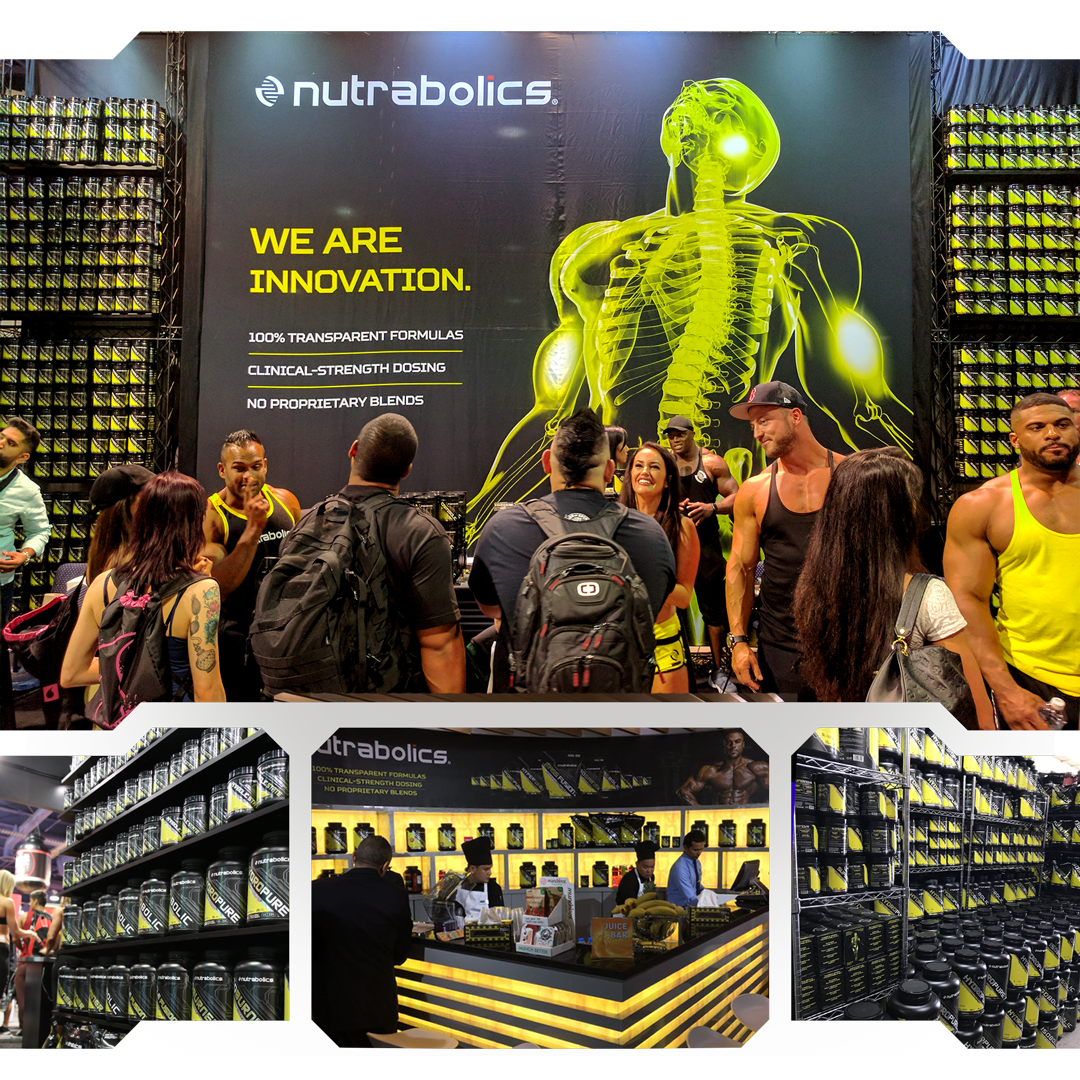


THE WIN
The futuristic elements at the core of this rebrand were rolled out across multiple formats from sellsheets and national ad publications to 20-foot-tall expo displays. Biotech styles were infused into meticulously scripted, VFX-rich product videos to ensure that at any touchpoint, consumers would feel cutting-edge science and innovation. The branding, packaging, and marketing was exceptionally well-received by retailers and consumers alike, increasing uptake and sell through while inspiring more repeat buys Years later, the “biohacking” trend took off and dozens of niche brands emerged with similar style elements. Nutrabolics’ new look can currently be found in 40 countries around the world.
